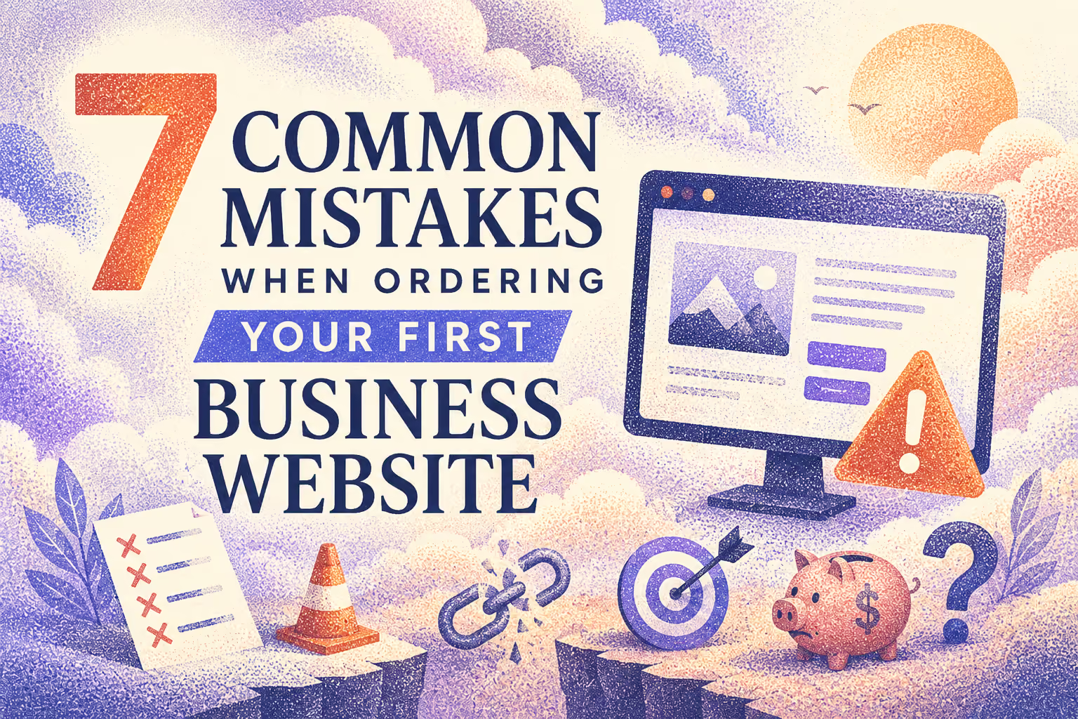
7 Common mistakes when ordering your first business website
Ordering a first business website feels simple until the process actually starts. Most owners assume the hardest part is picking a designer or a platform. In practice, the costly mistakes happen earlier, in decisions made before a single page is built. These mistakes rarely show up on launch day. They show up three months later, when the site is live but not bringing in customers, and nobody can quite explain why.
This guide covers the seven mistakes that come up most often with first-time website owners, along with what to do instead.
1. No Clear Call-to-Action
A website without a clear call-to-action gives visitors nowhere to go. They read the homepage, get a general sense of the business, and leave without booking a call, requesting a quote, or making a purchase.
This happens most often when a site is designed around looking good rather than guiding a decision. Every page should answer one question for the visitor: what do you want me to do next? A homepage without a clear next step is not a website. It is a digital brochure with no way to respond.
The fix is straightforward. Every page needs one primary action, stated clearly and repeated at natural points as the visitor scrolls. A contractor's site might push toward "Get a Free Quote." A consultant's site might push toward "Book a Call." Whatever it is, it should be impossible to miss.
2. Not Mobile-Optimized
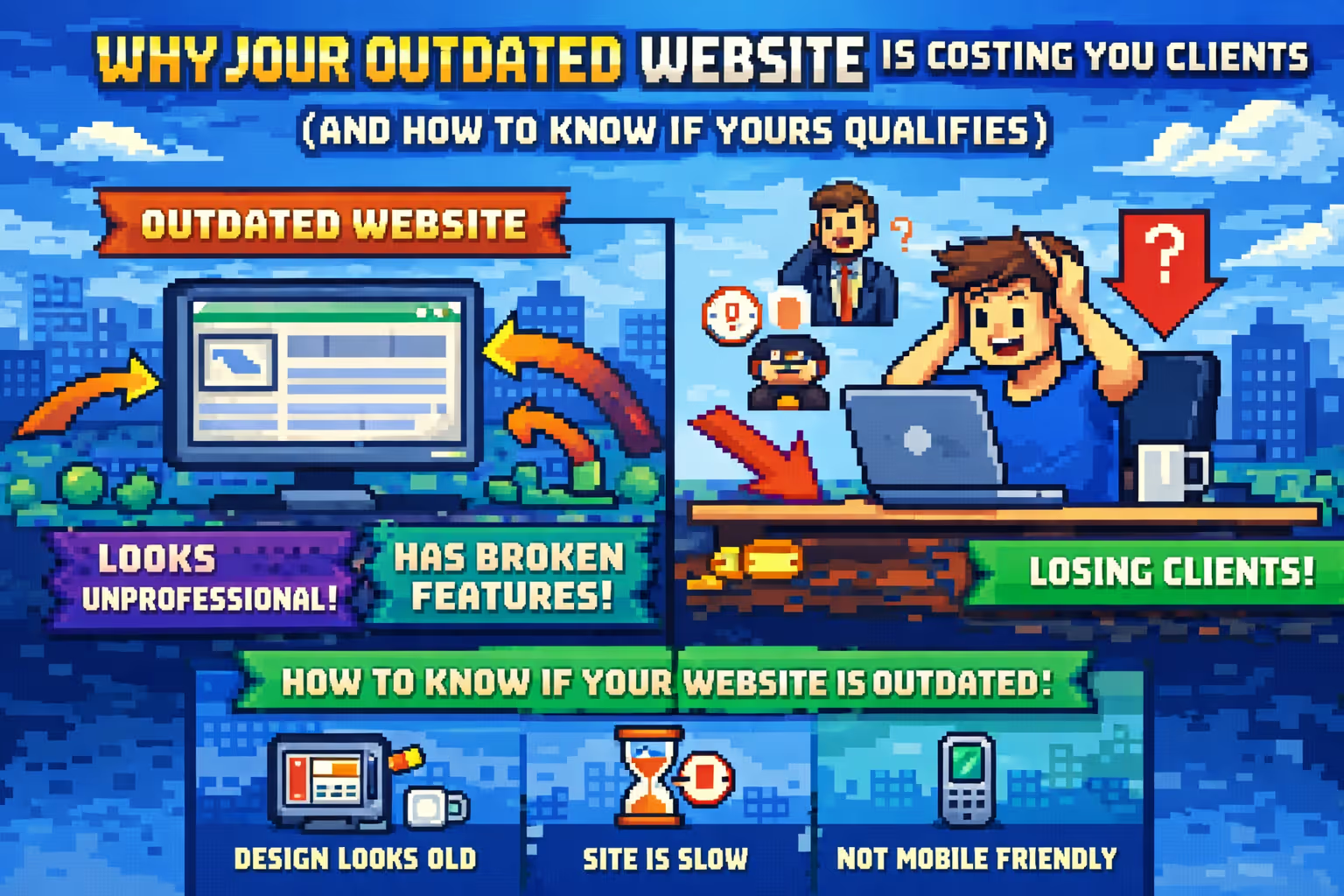
More than half of web traffic today comes from phones, and that share keeps growing. A site that was designed and tested only on a laptop screen often breaks down in ways the owner never notices, because they are not the ones viewing it on a phone in a parking lot between meetings.
Common mobile problems include buttons too small to tap accurately, text that requires zooming, forms that are painful to fill out on a touchscreen, and navigation menus that cover half the screen. Each of these is a small friction point on its own. Together, they are enough to send a visitor straight to a competitor's site.
Testing on an actual phone, not just a browser preview, catches most of these issues before launch. If a visitor cannot comfortably read, tap, and navigate a site on their phone, that visitor is gone before they ever learn what the business offers.
3. Slow Load Times
Page speed is one of the least visible mistakes and one of the most damaging. A site that takes four or five seconds to load loses a large share of visitors before the page even finishes rendering. Search engines notice this too, and slow sites are consistently ranked lower than fast ones.
Slow load times are usually caused by oversized images, unnecessary animations, and platforms that were never built with performance in mind. A photo straight out of a phone camera, uploaded without compression, can single-handedly slow an entire page.
Before launch, it is worth running a basic speed test and fixing anything that pushes load time past two or three seconds. This is a technical detail, but its effect on both visitors and search rankings is anything but small.
4. No SEO Foundation From Day One
Search engine visibility is often treated as something to think about later, after the site is live and the business has time to focus on marketing. By then, the site is usually missing the basic structure that search engines rely on to understand what a page is about.
This includes page titles and descriptions written for each page, a logical heading structure, and URLs that clearly describe the content instead of a string of random characters. None of this is difficult to set up correctly the first time. It becomes considerably more work to fix after the fact, especially once a site has been indexed with the wrong structure.
A website built without SEO in mind is not invisible immediately. It becomes invisible gradually, as competitors who did this correctly from the start pull ahead in search results.
5. Choosing Design Over Function
A beautiful website that fails to convert visitors into customers has not done its job. This mistake happens when the process is driven entirely by visual preference, picking colors, fonts, and layouts based on what looks appealing, without asking whether any of it helps a visitor take action.
Design matters, but it should support a goal, not replace one. A striking homepage with no clear message about what the business does, or who it serves, will impress visitors for a few seconds and then lose them. The strongest websites pair strong design with a clear structure that leads a visitor toward a decision.
Before approving any design, it helps to ask a simple question: if someone lands on this page knowing nothing about the business, will they understand what it offers and what to do next within a few seconds? If the answer is unclear, the design needs another pass regardless of how polished it looks.
6. No Content Plan Before Launch
Content is frequently treated as an afterthought, something to fill in once the design is finished. This produces generic placeholder text that never quite gets replaced, vague descriptions of services, and pages that read the same as every competitor's site.
A content plan built before design begins changes the outcome significantly. Knowing what each page needs to say, and to whom, shapes the layout itself. A services page written with real detail about pricing, process, and outcomes will always outperform a page with three vague sentences and a stock photo.
Writing this content takes time, which is exactly why it should start early rather than being rushed in the final week before launch.
7. Picking the Cheapest Option Without Checking the Total Cost
The lowest quote often looks like the smart choice at the start of the process. In many cases, it ends up being the most expensive option once the full picture becomes clear.
A very low price usually means shortcuts somewhere: a template that cannot be customized beyond basic colors, no ongoing support once the site is live, or a platform that becomes difficult and costly to update. Owners who choose based on price alone often find themselves paying for a second website a year or two later, once the limitations of the first one become impossible to work around.
A fair comparison looks past the upfront number and asks what is included: design flexibility, the ability to edit content independently after launch, ongoing support, and how well the platform will hold up as the business grows. The cheapest quote and the best value are rarely the same thing.
The Bottom Line
None of these seven mistakes are complicated to avoid. What they have in common is that they are far easier to prevent before a website is built than to fix after it goes live. A clear call-to-action, mobile testing, fast load times, SEO basics, a balance between design and function, a real content plan, and an honest look at total cost rather than sticker price, all of it comes down to planning the site around what it needs to accomplish, not just what it needs to look like.
A first business website is rarely the last one a business will need. Getting these fundamentals right the first time is what determines whether that first site becomes a long-term asset or an early lesson.

Milan Kostic
Freelance Webflow Developer