The difference between award-winning and high-converting websites
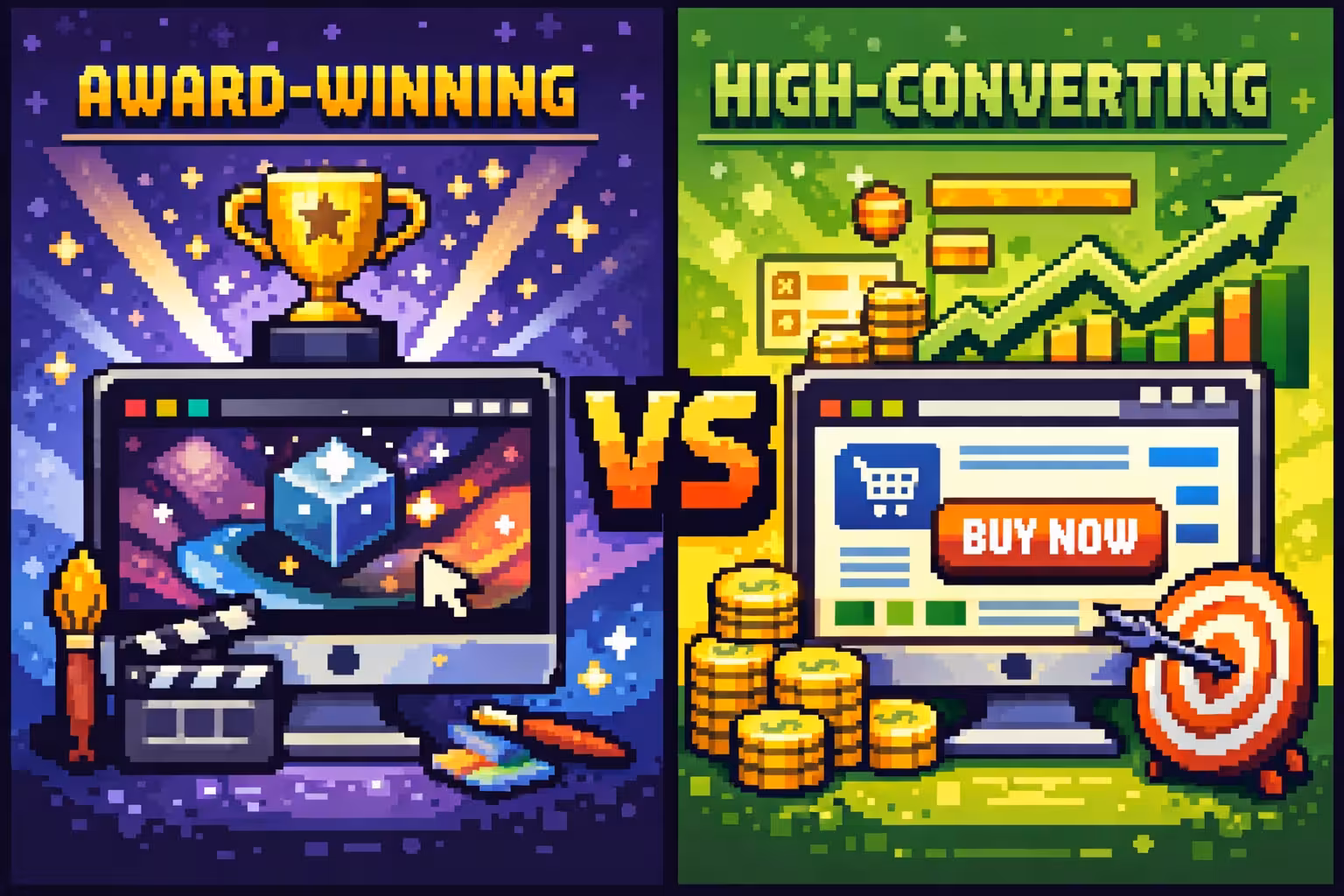
In the digital world, it's often assumed that a visually impressive website automatically equals a successful one. When design quality is discussed, awards and recognitions are frequently seen as proof that a project has been done well. However, in real business contexts, how a website looks and how it performs are very often not the same thing. This is where the difference between award-winning and high-converting websites becomes clear.
This distinction is not about whether a website is "good" or "bad," but about what the website is actually built to achieve. Different goals require different approaches, and understanding this difference is essential for making smarter decisions in design and development.
What defines an award-winning website
Award-winning websites are usually created in environments where creativity, originality, and brand expression are the top priorities. Their main purpose is not to push users toward an immediate action, but to leave a strong emotional impression. These websites often rely on unconventional layouts, expressive animations, and non-standard navigation patterns to stand out from similar solutions.
The user experience on award-winning websites is often designed as a journey. Visitors are encouraged to explore the content gradually, discovering visuals and interactions along the way. In this context, speed and clarity are sometimes intentionally sacrificed to protect the creative vision and storytelling.
How high-converting websites are built
High-converting websites start from a very different mindset. Their purpose is clearly defined and measurable. These websites are built to help users make decisions more easily and to remove any unnecessary friction between the visitor and the desired action.
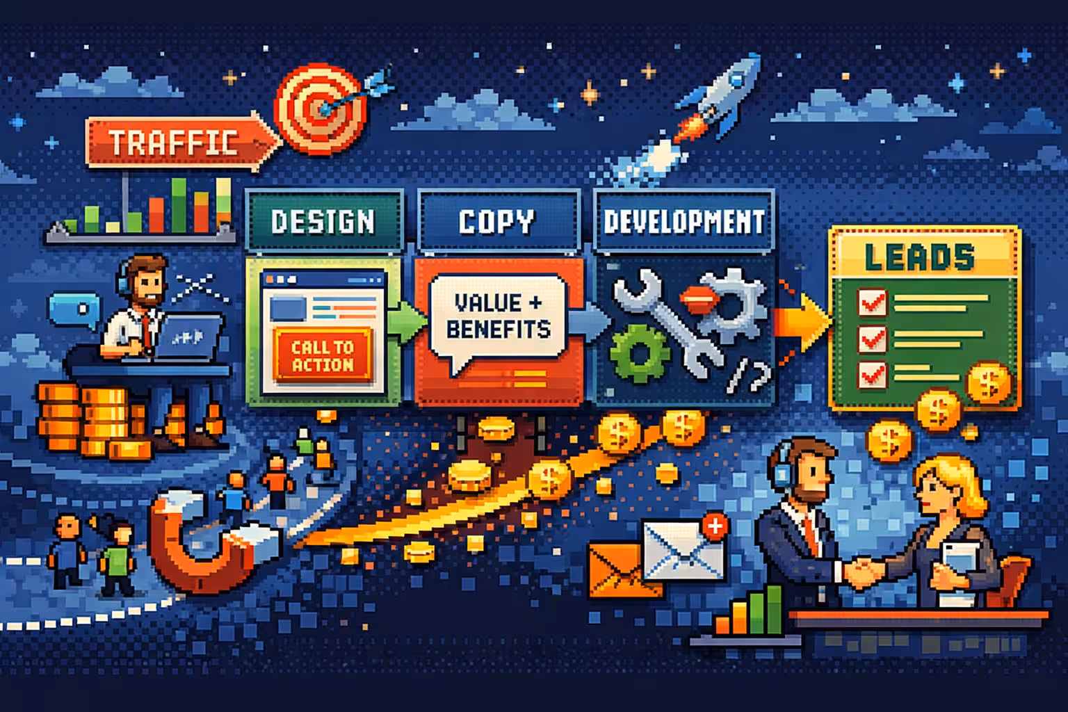
Rather than experimenting with form, high-converting websites rely on well-established user behavior patterns. Navigation is predictable, messaging is clear, and content structure guides users through a logical flow. Visual design is still important, but it serves functionality instead of competing with it. If your site has traffic but isn't converting, the issue is usually structural: see how to fix conversion issues when you already have traffic.
Why these two approaches often conflict
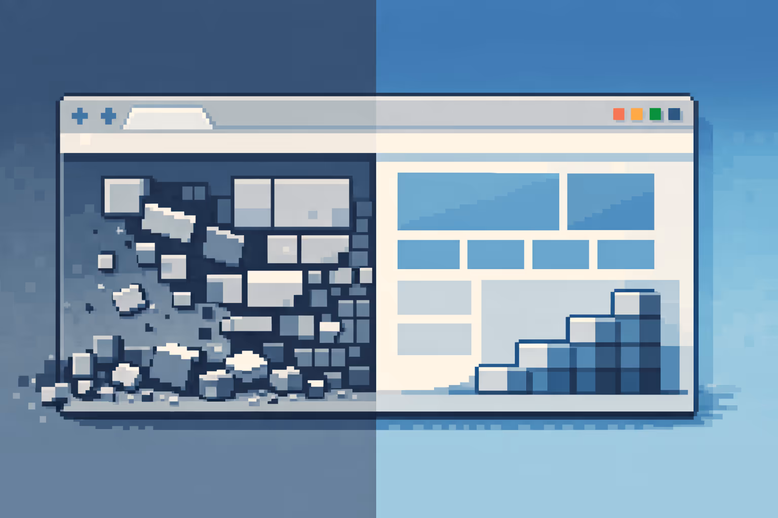
Problems arise when a single website is expected to excel at both approaches without understanding the trade-offs involved. When creative freedom and strict optimization are forced together without a clear strategy, the result is often a website that struggles in both areas.
In these cases, users may be impressed by the visuals but confused about what to do next. Key messages get lost behind animations or interactions, while excessive optimization can strip a brand of its personality and make the website feel generic.
The misconception that beautiful design guarantees conversions
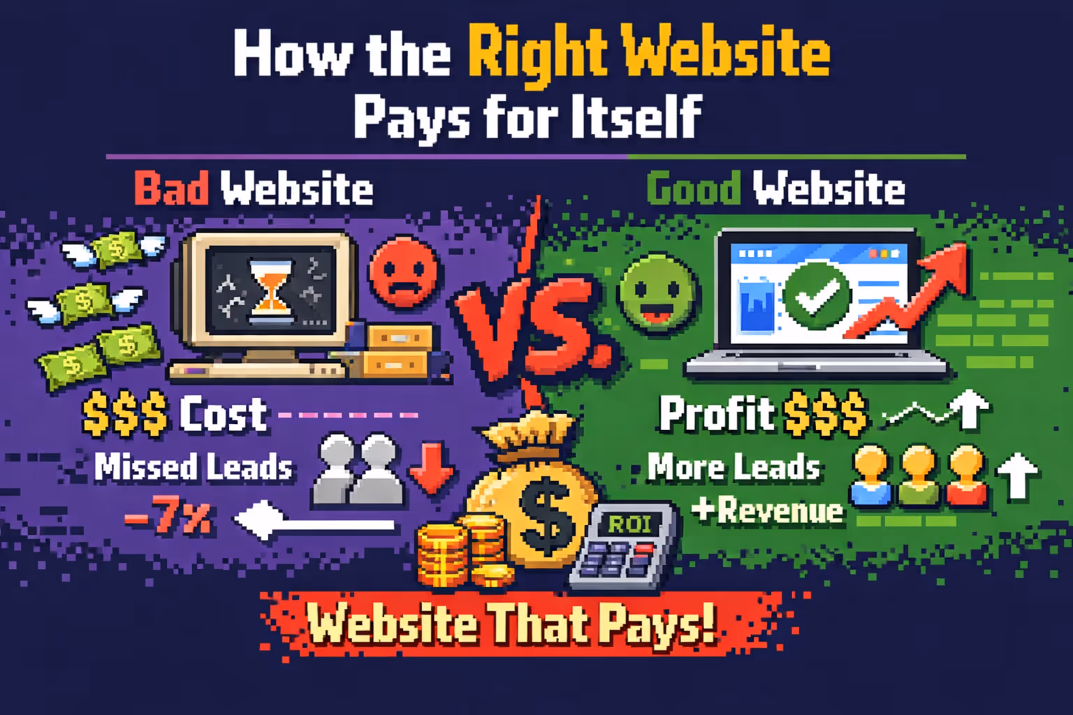
One of the most common misconceptions in web design is the belief that a beautiful website will naturally lead to better results. While good design can improve trust and credibility, it rarely delivers meaningful outcomes on its own without a clear strategy behind it.
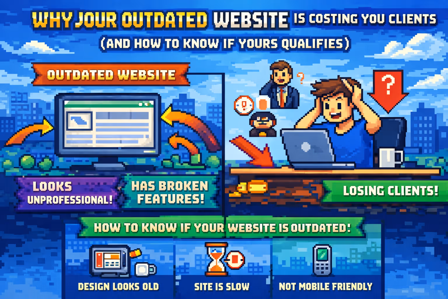
High-converting websites often appear simpler because they intentionally remove anything that doesn't serve the primary goal. This doesn't mean they lack design quality, but rather that every visual element is carefully considered and placed with purpose. An outdated website, no matter how it looks, will almost always struggle with conversions.
When an award-winning approach makes sense
An award-winning approach is particularly effective when the primary goal is long-term brand positioning. For creative studios, design agencies, and innovative brands, this type of website can be a powerful tool for differentiation and recognition.
In these cases, success is not measured by conversion rates, but by how the brand is perceived and remembered.
When conversion-focused design should take priority
On the other hand, for products and services where the website is a key sales or lead-generation channel, clarity and efficiency should come first. Every section of the website needs a clear role and should guide users toward the next step without hesitation.
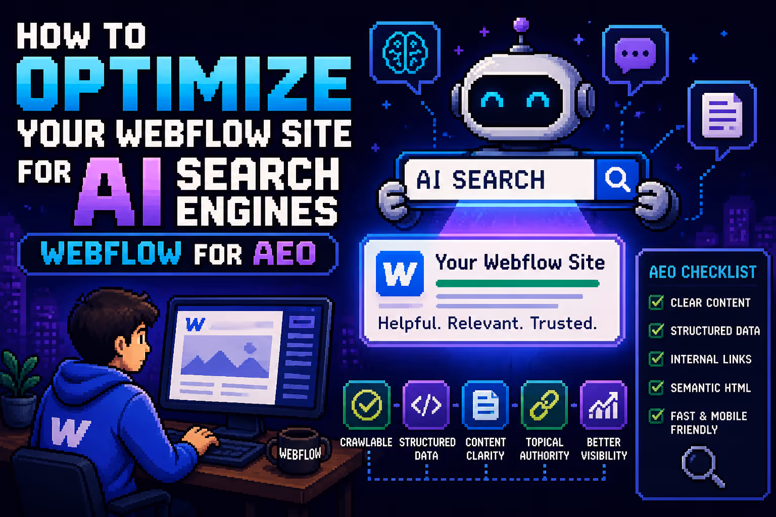
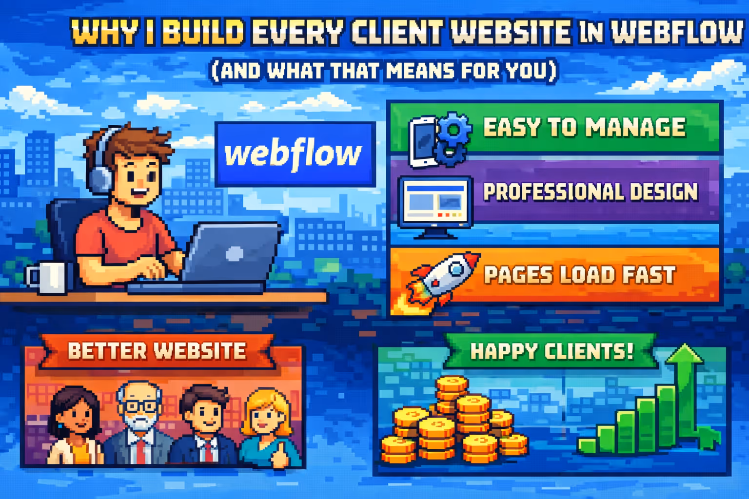
In these projects, visual design still matters, but only as a support system for usability, trust, and decision-making. The platform you build on also plays a role: why I build every client website in Webflow covers exactly this mindset.
Finding the right balance
The most successful websites rarely sit at extreme ends. They are created when design and strategy are treated as a single process. The right balance comes from understanding the target audience, business goals, and the context in which the website exists.
Balancing aesthetics and conversions is not a negative compromise, but a deliberate prioritization of what truly matters.
Which businesses benefit most from each approach
Not every business needs the same type of website. The right approach depends on the company's goals, market position, and how the website supports growth. Understanding which model fits which type of business helps avoid unrealistic expectations and leads to better long-term results.
Award-winning websites
This approach works best for businesses where brand perception, creativity, and emotional impact play a central role. These websites are designed to impress, differentiate, and leave a lasting visual memory rather than to drive immediate conversions.
- Creative and design agencies
- Branding and marketing studios
- Art, culture, and creative projects
- Innovative or experimental products
- Fashion, lifestyle, and luxury brands
- Companies focused on brand positioning rather than direct sales
High-converting websites
This approach is ideal for businesses where the website is a primary sales, lead-generation, or growth channel. Clarity, usability, and measurable outcomes are more important than visual experimentation.
- SaaS companies and digital products
- B2B service providers
- Startups focused on growth and validation
- E-commerce businesses
- Consulting and professional services
Conclusion
Award-winning and high-converting websites are answers to two very different questions. One asks how to create an impression, while the other asks how to achieve results. The real problem is not the difference between them, but the misunderstanding of their purpose.
When goals are clearly defined, design and development can work together in the same direction. The result is not just a beautiful website, but a website that genuinely makes sense for the business behind it.

Milan Kostic
Freelance Webflow Developer