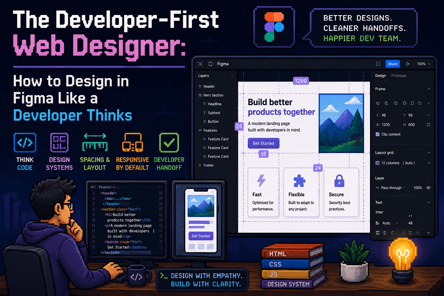
The Developer-First Web Designer: How to Design in Figma Like a Developer Thinks
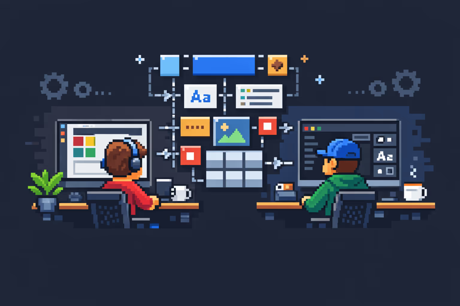
Most web designers learn Figma the same way. They watch tutorials, master the pen tool, build beautiful screens, and hand off a link to the developer. Then the back-and-forth starts. "Can you add the spacing values here?" "What font size is this on mobile?" "This button doesn't exist in the component library." "Why are there 47 shades of blue?"
If you have been designing for a while, you already know this pattern. You might not have a name for what the fix looks like, but experienced designers have quietly developed it over years of watching their files get handed off and rebuilt from scratch.
The fix is called a developer-first mindset. It does not mean you need to write code. It means you design with an understanding of how your work will actually be built, so that what leaves your Figma file and what ends up on the screen are the same thing.
What Experienced Designers Already Know (But Rarely Say Out Loud)
Senior designers who have worked with developers long enough develop certain habits instinctively. They stop using random spacing values and start working on an 8-point grid. They name their layers properly because they have seen developers curse at a file full of "Frame 247 copy 3." They build one button component and connect everything to it, instead of drawing a new button on every screen.
These habits were not taught in most design courses. They were learned through friction: through the moment a developer had to ask what the hover state looks like, through the redesign that broke twelve screens because the color was hardcoded instead of tied to a style.
If you are earlier in your career, you do not have to wait for the friction to teach you. You can adopt this thinking now, inside Figma, before you ever hand off a single file.
The Core Shift: From Designing Screens to Designing Systems
The most fundamental difference between a junior designer and a developer-first designer is not skill level. It is the unit of thinking.
Junior designers think in screens. They open a new frame, design the homepage, then the about page, then the contact page. Each screen is its own project.
Developer-first designers think in systems. Before they design a single screen, they ask: what are the rules that will govern every screen? What are the colors, the type sizes, the spacing increments, the component behaviors? Once the system is defined, the screens become the easy part.
This is not just philosophical. It has direct practical consequences in Figma.
Auto Layout: Your Direct Line to Flexbox
Auto Layout is the single most important Figma feature for developer-first designers, and it is also the most misunderstood one.
Most designers treat Auto Layout as a convenience, something that makes resizing easier. That is true, but it misses the point entirely. Auto Layout in Figma is a visual representation of CSS flexbox. When you set a frame to horizontal Auto Layout with a gap of 16 and padding of 24, you are describing a flex container with gap: 16px and padding: 24px. That is exactly what the developer will write.
When you do not use Auto Layout, you are describing absolute positioning. Which means the developer has to figure out the layout logic themselves, and they may do it differently than you imagined.
The practical rule: any group of elements that has a relationship to each other should be an Auto Layout frame. Navigation items, card content, form fields, button text and icon combinations, section layouts. If elements need to stack, wrap, or space themselves consistently, Auto Layout is the answer.
The specific behaviors to understand:
Direction sets whether children stack horizontally or vertically. This maps to flex-direction in CSS.
Gap is the space between children. This maps to gap in CSS.
Padding is the space inside the container. Same word, same concept in CSS.
Hug content means the container shrinks to fit its children. Fill container means it expands to fill its parent. These map to width: fit-content and width: 100% respectively.
Wrap maps to flex-wrap: wrap in CSS, which is how content flows to the next line on smaller screens.
Understanding these behaviors means your handoff already communicates layout logic. The developer inspects your frame and sees the exact structure you intended, without having to guess.
Variables: Design Tokens Before They Reach the Developer
Figma Variables are the closest thing the tool has to CSS custom properties. A CSS custom property looks like this: --color-primary: #0057FF. A Figma variable looks exactly the same in concept: a named value that can be referenced everywhere and changed in one place.
When you use a raw hex code on a button, the developer has to ask: is this the brand primary? Should this use the existing variable in the codebase, or is this a one-off? When you use a variable named color/brand/primary, the question is already answered.
The three variable types that matter most for web design handoff:
Color variables map directly to color tokens in code. Set up your color system in layers: primitive values like blue-500 at the base, then semantic references like color/action/primary on top. Developers work with semantic tokens, not raw hex codes. Your Figma file should reflect that.
Number variables handle spacing, border radius, and sizing. A spacing system based on 4px or 8px increments means your developer never has to second-guess whether 14px padding was intentional or a mistake. If it is not on the scale, it is a mistake.
Boolean variables control component states: is this element visible? Is this variant active? These power interactive components and connect directly to how conditional rendering works in code.
The moment you set up variables and connect your components to them, your file becomes a living system. Change one variable and watch it propagate everywhere. This is what design systems actually mean in practice.
Components and Variants: One Source of Truth
Copy-pasting a button is not design work. It is busywork that will eventually cause problems.
Every repeating element in a design should be a component. Not because it saves time in the short term, but because it creates a single point of control. When the button changes, it changes everywhere. When the card layout shifts, every card shifts. This is how production code works, and your design file should model it.
Variants extend this further. Instead of three separate button components named Button Primary, Button Secondary, and Button Disabled, you build one component with a property panel that controls state, size, and type. The developer sees one component with defined states. No ambiguity about whether the disabled button is a separate element or the same element in a different state.
Component properties in Figma map closely to props in component-based development. When you set up a card component with a boolean property called Has Image that shows or hides the image slot, you are describing a prop that a developer would actually write.
The Style Guide as a Contract
A style guide in Figma is not a nice-to-have presentation slide at the start of the file. It is the contract between the designer and the developer. It defines what is allowed and what is not.
A complete style guide covers the color palette with variable names, the type scale with size, weight, line height, and letter spacing for each level, the spacing scale, the border radius options, the shadow styles, and the grid system.
When a developer opens a new project file and sees a clean style guide with named variables and documented components, the build process is significantly faster and more predictable. When they open a file and start seeing values that do not match any pattern, they start making judgment calls. Those judgment calls accumulate into inconsistency.
The style guide is where you document the system before you use it. It forces you to make decisions intentionally instead of on the fly.
Relume and the Value of Pre-Built Systems
Relume is a component library built specifically for web design. For designers who are newer to the developer-first mindset, it is genuinely useful as a reference point, not necessarily as a starting library for every project, but as an example of how a system designed for implementation actually looks.
Every Relume component is built with Auto Layout, uses consistent spacing, follows a naming convention, and is structured to map cleanly to how it would be built in code. Looking at how Relume constructs a navbar or a card section tells you more about developer-first design than most tutorials do.
The principle it demonstrates is this: design decisions should be systematic before they are creative. The grid, the spacing, the component structure come first. The visual expression comes second, within the rules of the system.
Naming: The Underrated Part of Handoff
No developer has ever been grateful for a layer named Rectangle 58. They have been grateful for card/thumbnail/image.
Naming conventions in Figma follow the same logic as naming conventions in code. Use forward slashes to create hierarchy. Use lowercase and consistent terminology. Name things for what they are, not what they look like.
A layer named blue box describes appearance. A layer named notification/badge/count describes purpose and context. When a developer is building the notification system, they can find every relevant element instantly.
This applies to components, variables, styles, and frames. Consistent naming is the part of developer-first design that costs the least effort and pays the most dividends over time.
Responsive Thinking Starts in Figma, Not at the End
One of the most common mistakes in junior designer files is that responsive behavior was never defined. The desktop looks perfect. The developer asks what the mobile layout should be and gets a shrug or a quick sketch.
Developer-first designers define responsive behavior in the file. This does not always mean designing every breakpoint in full detail. It means using constraints and Auto Layout in a way that communicates intent. A section built with fill container and auto-wrapping columns communicates that it should stack vertically on smaller screens. A navigation built with Auto Layout and horizontal spacing communicates how it collapses.
When you use Figma constraints correctly, the developer inspecting your frame sees not just what it looks like at one size, but how it should behave when the browser resizes.
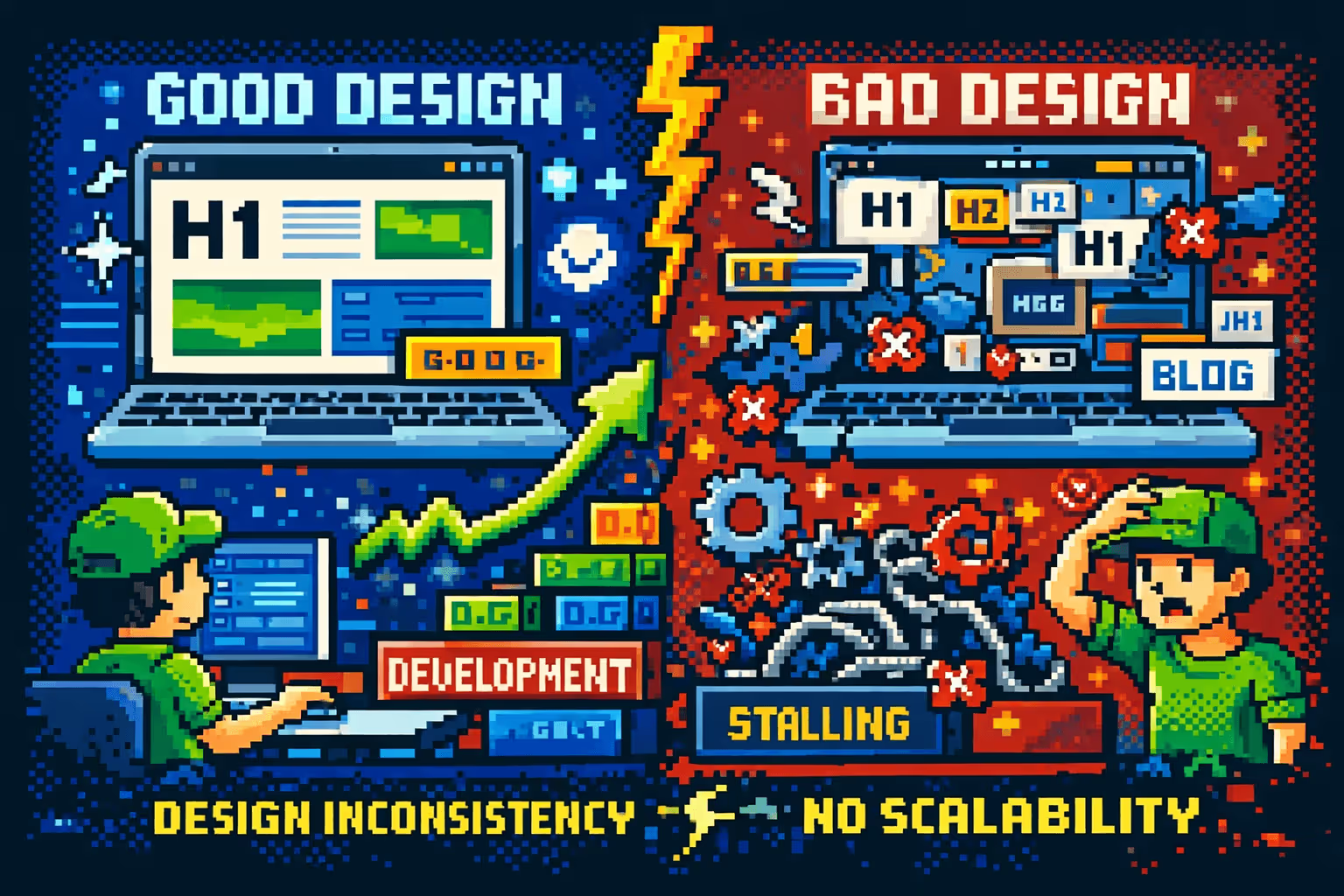
The Real Measure of a Good Design File
The measure of a good design file is not how beautiful it looks on a presentation screen. It is how many questions a developer does not have to ask.
Every question a developer asks during a build represents a gap in the file. Sometimes those gaps are genuinely ambiguous design decisions that need discussion. More often, they are things the designer knew but did not communicate: the hover state, the empty state, the mobile behavior, the spacing between two specific elements.
A developer-first designer anticipates those questions and answers them inside the file, through proper Auto Layout, connected variables, well-named components, and documented states.
This is the mindset shift that experienced designers have made, often without naming it. You do not have to wait for years of friction to develop it. You can start with your next Figma file, before the first frame is drawn, by asking one question: how is this going to be built?
The answer to that question, embedded throughout your design decisions, is what makes the difference between a file that frustrates and a file that ships cleanly. If you want to understand how this thinking connects to the build side, the post on going from Figma to Webflow covers what happens after the handoff.
Author:

Milan Kostic
Freelance Webflow Developer