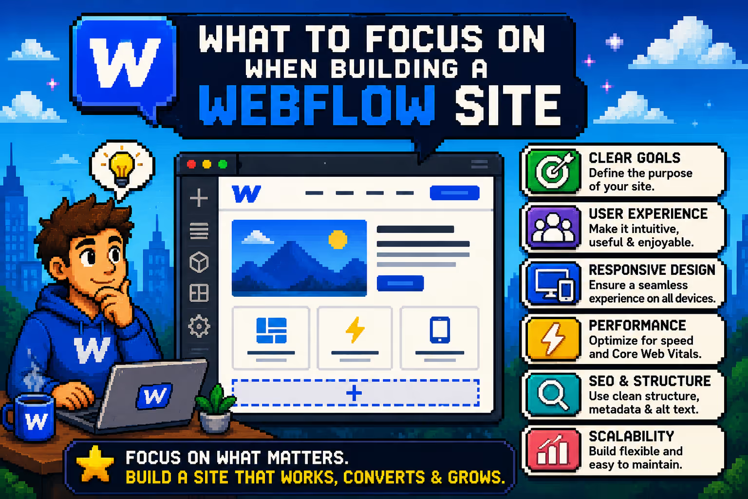
What to focus on when building a Webflow website
1. Class Structure, Global Styles, and a Naming System
One of the first decisions you need to make before you start building is how you will organize classes and styles across the project. This might not feel like a priority at the beginning, but it becomes very important once the site grows beyond a few pages.
Webflow gives you complete freedom in how you name classes, which can be both an advantage and a trap. Without a system, you can easily end up with dozens of classes that do the same thing, or class names that tell you nothing about what they are for. The same goes for styles: if you do not define global styles for typography and colors from day one, every new page ends up slightly different from the last and the design loses cohesion. Webflow supports CSS variables, which means changing your brand's primary color can be applied across the entire site in seconds, but only if you set them up from the start.
The good news is that you do not have to invent a system from scratch. There are frameworks built specifically for Webflow that you can use as a foundation. This is something I have written about in more detail in the post on why the right Webflow framework matters for scalable websites.
The three most widely used are:
Client First is the most popular choice in the Webflow community. It is built on a clear class naming logic, comes with solid documentation, and includes ready-made components like Tabs, Sliders, and Marquee sections that save time on most projects. Read the Client First docs
MAST is the framework I personally use on every project, and the reason is practical. MAST is lightweight by design, which directly affects site load speed. One developer who migrated a client project to MAST reduced the site's CSS file size by 60%. On top of that, MAST fully leverages Webflow's native variables and modes, making it ideal for a design system approach. Webflow itself used MAST when rebuilding their new enterprise site, which says a lot. If you want to go deeper on how framework choice affects long-term project health, the post on why designers should understand Webflow frameworks is worth a read. Explore MAST
Lumos is a more advanced framework aimed at developers who already have solid Webflow experience and want a stricter, more consistent system for complex projects. It has a steeper learning curve but delivers a very clean and scalable codebase. Read the Lumos docs
Whichever system you choose, consistency from day one is what makes the difference.
2. Planning Content That Will Change
Before you start building, think about which parts of the site will change over time. Blog posts, testimonials, case studies, team members, FAQ sections, pricing plans: all of these are types of content that grow and evolve.
Webflow has a powerful CMS built exactly for this. When you set up content through the CMS from the beginning, adding new items becomes straightforward and does not require going into the Designer every time. You can do it yourself directly through the Webflow Editor, and if you have a team or collaborators, they can update content without any technical knowledge.
If you put the same content as static text directly in the layout because it is faster, every change means manual editing. That works in the short term but becomes tedious and error-prone as soon as the content starts to grow.
3. Responsiveness and Mobile View
More than half the traffic on most websites today comes from mobile devices. This is not a statistic to impress anyone, it is a reality that every site has to handle.
Webflow cascades styles from desktop down to smaller screens, which means what you build on desktop affects every breakpoint below it. If you are not checking how the site looks on tablet and mobile as you build, you can end up with a lot of work to fix at the end.
A good habit is to check every breakpoint after each major section, not at the end of the project. Tablet, mobile landscape, and mobile portrait can each hide different problems and all of them deserve attention.
Beyond screen sizes, do not forget about browsers. Chrome, Safari, and Edge render certain things differently, especially on iOS where Safari has its own quirks. A quick check across multiple browsers before the site goes live can save you from unpleasant surprises after launch.
4. Animations and Interactions
Webflow Interactions are one of the platform's most attractive features, and it is easy to get carried away with what is possible. Parallax effects, scroll animations, hover interactions: all of these can add dimension to a site and make it feel alive.
But animations have another side. Too much movement on a page can pull attention away from the message the site is trying to communicate. Elements that move aggressively on scroll can feel chaotic. Hover effects that change too many things at once can confuse users rather than help them.
A good rule is that every animation should have a purpose. If an animation guides the user's eye toward an important part of the page or confirms that they clicked the right element, it earns its place. If it exists only because it is possible, the site is probably better without it.
Pay particular attention to mobile. Many animations that look great on desktop degrade performance or behave strangely on phones. Reduce the complexity of animations on smaller screens or turn them off entirely where they are not necessary.
5. SEO Basics
SEO is a topic you could discuss for hours, but there are fundamentals that every site needs from day one regardless of everything else.
Heading hierarchy is one of them. Every page should have one H1 that clearly describes what that page is about. H2 and H3 headings should follow a logical order and help both users and search engines understand the structure of the content.
Every page needs a unique page title and meta description. This is what appears in Google search results and directly affects whether someone will click on your site. Webflow gives you an easy place for this in Page Settings for each page.
Images should have alt text that describes what is in the image. Open Graph tags matter for how the site looks when someone shares it on social media. These are small things that together make a big difference.
6. Symbols and Components for Consistency
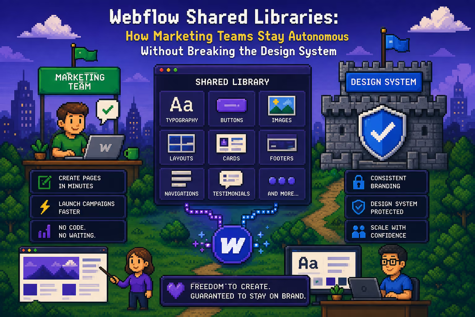
The navbar and footer appear on every page of the site. If you build them as regular elements without using Symbols or components, every change means making it in every place separately.
Webflow Symbols and components solve this. When you build something as a Symbol, it exists in one place and appears everywhere you add it. When you change the content of a Symbol, that change is automatically applied on every page.
This is especially useful for navbars, footers, repeating CTA sections, and card layouts that are used more than once. Besides saving time, it also reduces the chance of errors because you do not have to remember to make the same change everywhere it needs to happen.
7. Performance and Load Speed
A site that looks great but loads slowly loses visitors before they even see what it offers. Google also values speed as a ranking signal, so performance directly affects SEO as well.
The most common cause of slow Webflow sites is unoptimized images. Webflow automatically optimizes images you upload, but dimensions and format still play a role. Do not put a 4000px wide image in a place where it displays at 400px.
Webflow also has a built-in performance analysis tool, but it is a good habit to run a Lighthouse audit in Chrome periodically. A Performance score above 80 is a solid target. Pay special attention to Largest Contentful Paint, which is the metric that directly corresponds to how quickly users see the main content of the page.
8. Testing Before Launch
When the site looks ready, go through a checklist of things to verify before you launch. This does not have to be complicated, but it should be systematic.
Go through all pages on a mobile device, not just in Webflow preview. Check every link leads to the right place. Look at how forms appear and whether they work correctly. Verify that all images have alt text. Open the site in Safari, Chrome, and Edge.
Run a Lighthouse audit and see what it says. Check that the site has a favicon. Look at how it appears when shared on WhatsApp or LinkedIn: the Open Graph image and title should be set correctly.
Those twenty minutes of checking can catch things that would otherwise slip through and leave a bad first impression.
Conclusion
Webflow gives you the tools to build an excellent site, but no tool makes decisions for you. Thinking about structure, content, responsiveness, and performance before you start building means less going back and a better end result.
The good news is that you do not have to master all of this at once. Every project is an opportunity to do some of these things better than the last time.

Milan Kostic
Freelance Webflow Developer